Robert Half DLS
A comprehensive audit on Robert Half's Design Language System's usage of color, and color naming conventions.
Role:
Design Research,
Design Operations,
Design Systems Thinker
Team:
Usman Khan,
Matthew Carver,
Rina Scott,
Misty Reed
Timeline:
5 Weeks
Tools:
Figma,
Zeplin
Results
I presented my final findings to design leadership. Currently, argodesign's DLS work lives on Robert Half's website

Context
argodesign needed to build a new design language system for Robert Half, and convince their executives of its value
argodesign had a dedicated team working with Robert Half in the past year to help rebuild their visual identity from the ground up by introducing to the company a new design language system. On top of that, our team was creating a slide deck to explain to Robert Half's executives about what a DLS is and how it could elevate their company's digital presence.
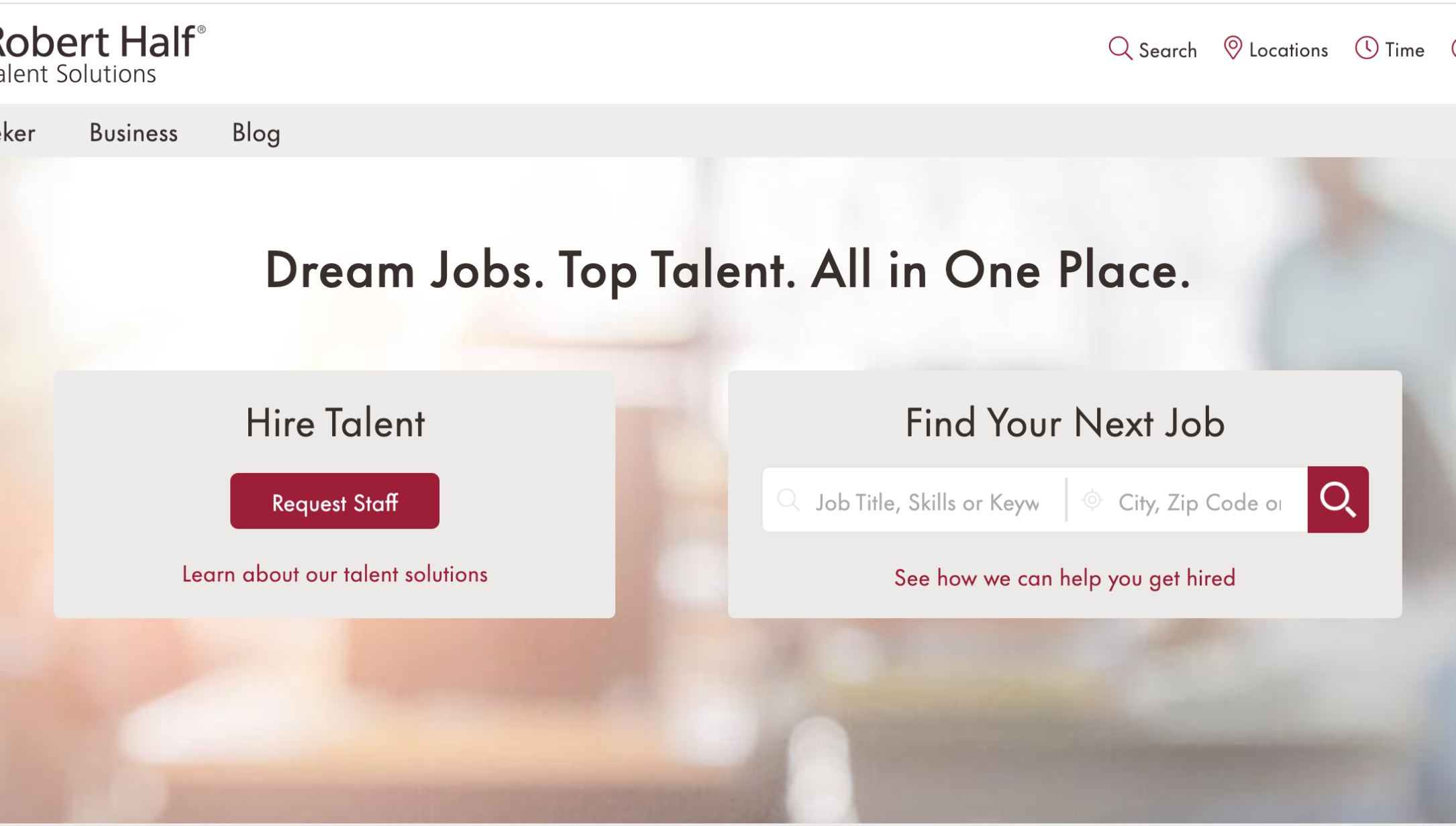
This was the state of the homepage at the time, which was in need of a visual update
Initial Research
To help me understand design systems, I started by gathering information on why they are useful
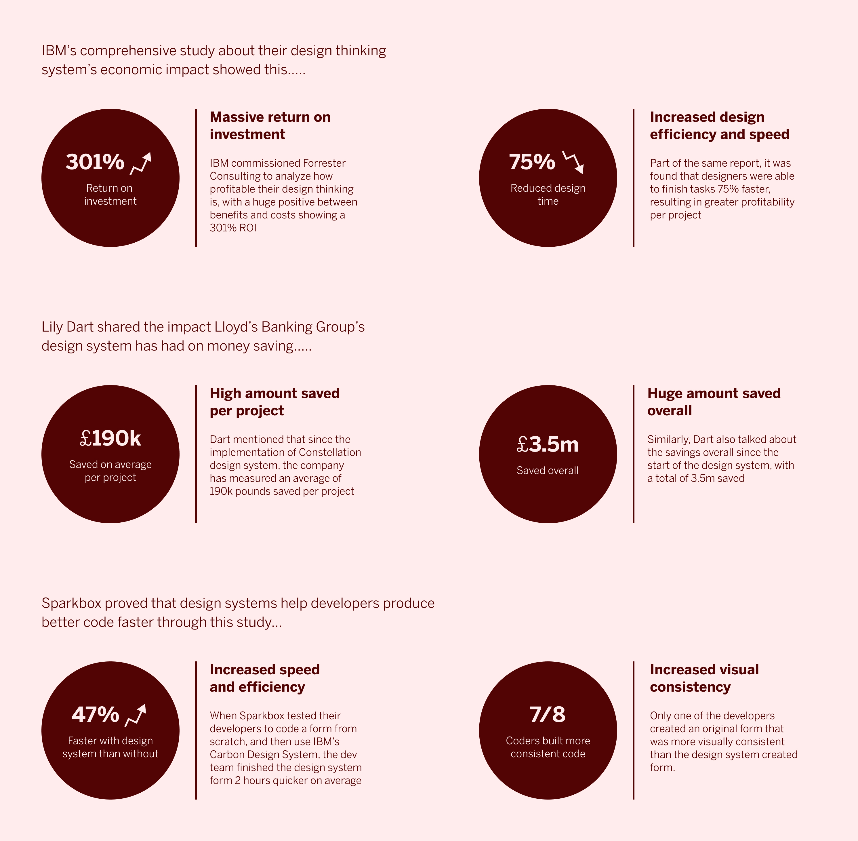
I couldn't dive right into Figma or Zeplin due to account verification issues, so I gathered resources necessary to show Robert Half's leadership team why a design language system is financially beneficial in the long term. It was necessary to understand that executive level leaders sometimes don't have the same grasp on the impact of a design system, so we needed to speak in terms of concrete numbers. I found studies that focused on terms like: return on investment, amount of time saved, and amount of profit generated over time.
Prompt
I was tasked with coming up with a uniform system for color naming conventions
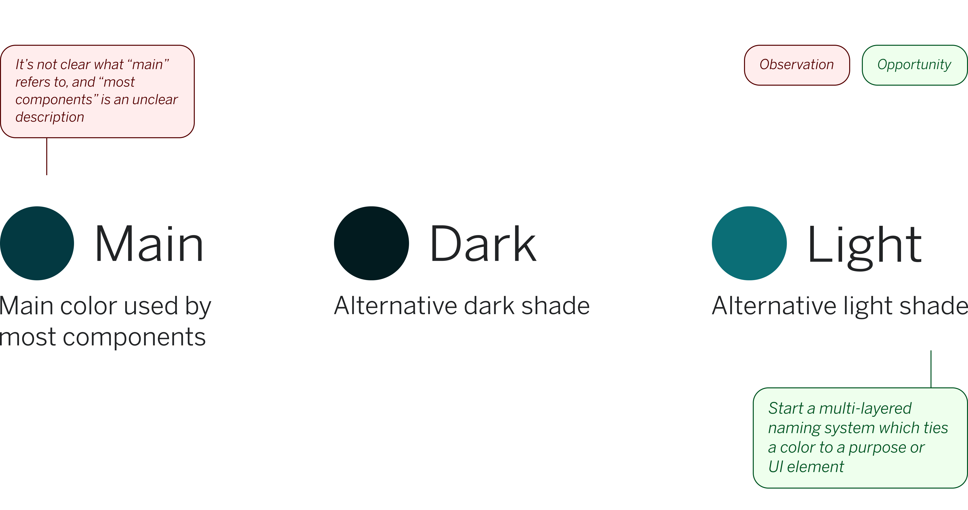
My role was to understand Robert Half's current progress on naming and documenting colors in their system, and rethink how it was being done. At the time, our team with Robert Half had already designed multiple new components with a style guide. Designers were using Zeplin to store and organize different components and colors, and engineers were using Storybook to document the front-end code. However, the colors were named in a way that was confusing both developers and designers. This was leading to inefficient and incorrect use of colors. I worked with a developer and two Robert Half designers to rethink the current naming scheme, and you can find an example of the existing scheme below.
Observation 1
Color names didn't give any insight into function
The most noticeable aspect of the current color naming conventions was that when they stood alone, they had vague names like "Main", "Primary" or "Light". The colors were sorted into different categories, but the naming convention didn't reflect which category a color was in or what function the color served in the category. Here are some example colors from the Primary section.
Observation 2
Categories for colors were sometimes too broadly named, or could benefit from reorganization
For example, the "Text" category housed colors named "Primary", "Secondary", "Tertiary", which also further proves the first point of needing multiple layers in one color name. Multiple colors in the whole organization were just named "Primary" which would inevitably lead to confusion. Furthermore, having a section only named "Text" without accounting for the nuance of headers, sub-headers, and copy text had the potential for color confusion in the future. Another example was the "Other" category which included colors such as "Visited Link" and "Card Detail Icon". A visited text link could potentially live under the text category, so we felt that general rethinking of category organization would be beneficial.
Competitive Analysis
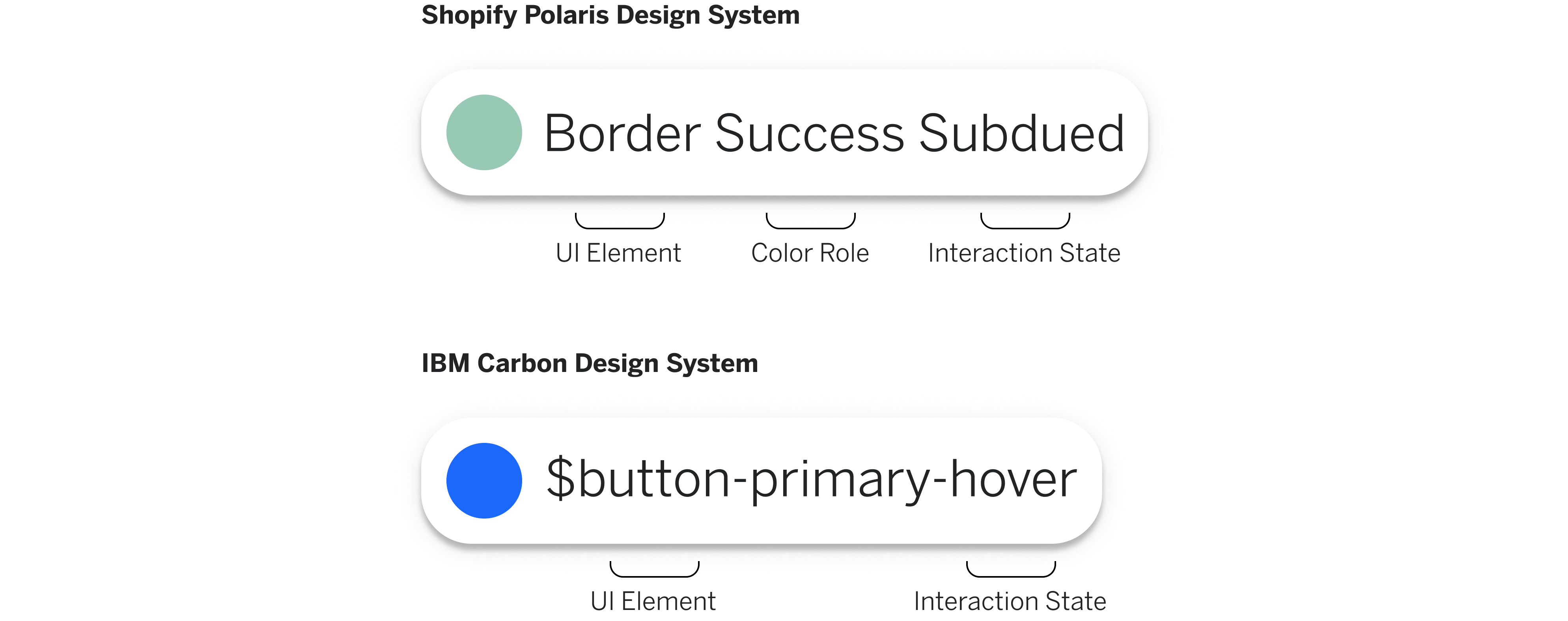
Successful design systems from Shopify and IBM used layered naming convention based on function
Diving deep into the IBM Carbon Design System and the Shopify Polaris Design System proved that naming colors need to dive deeper than "Primary" or "Main". Colors were tied to physical UI components, such as buttons, text, navigation bars, and info widgets, and not just abstract ideas. Shopify in particular broke down effectively how to layer a color name so that the UI element, the function, and the state of the UI component was easily identifiable. When searching in a system designers are not looking for a specific hex code but for a color to complete a certain task.
Ideation
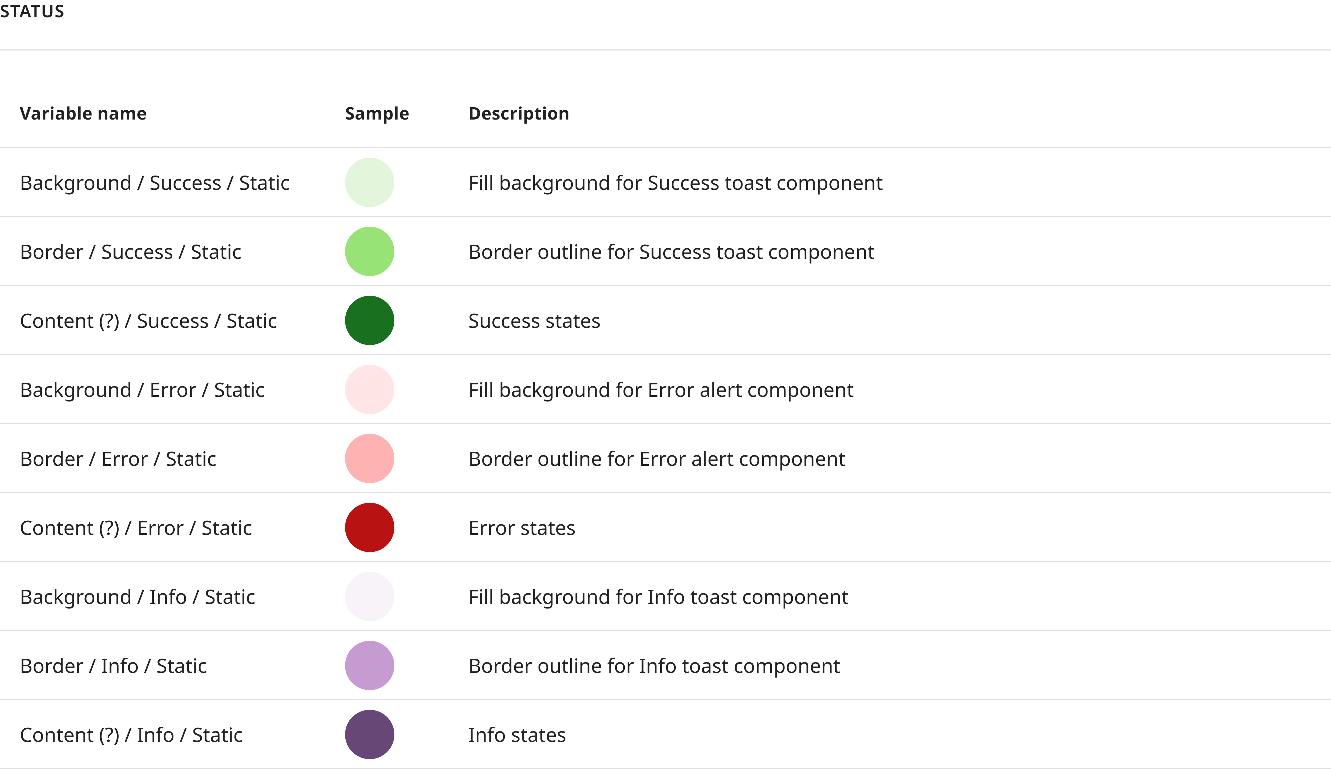
My first attempt adopted conventions from Shopify, testing colors from the "Status" category
Robert Half has a Status component category dedicated for toasts that give status updates within the website. This category was ideal for me to test multi-tiered color naming because of its straightforwardness and non-complexity in the component structure.
Feedback
The team wanted me to refocus on how to incorporate names like Primary and Secondary into naming conventions
When showing progress to team members around renaming the Status section, they wanted me to reconsider using Primary and Secondary. While a naming convention that highlights corresponding UI element, color role, and interaction state was useful, it works best when there's one of each type of component on the screen. If there's two of the same type of component on the page, CTA buttons for example, how would we call out the colors?
Pivot Point
I pivoted to a double-layered naming scheme to account for nuances in components
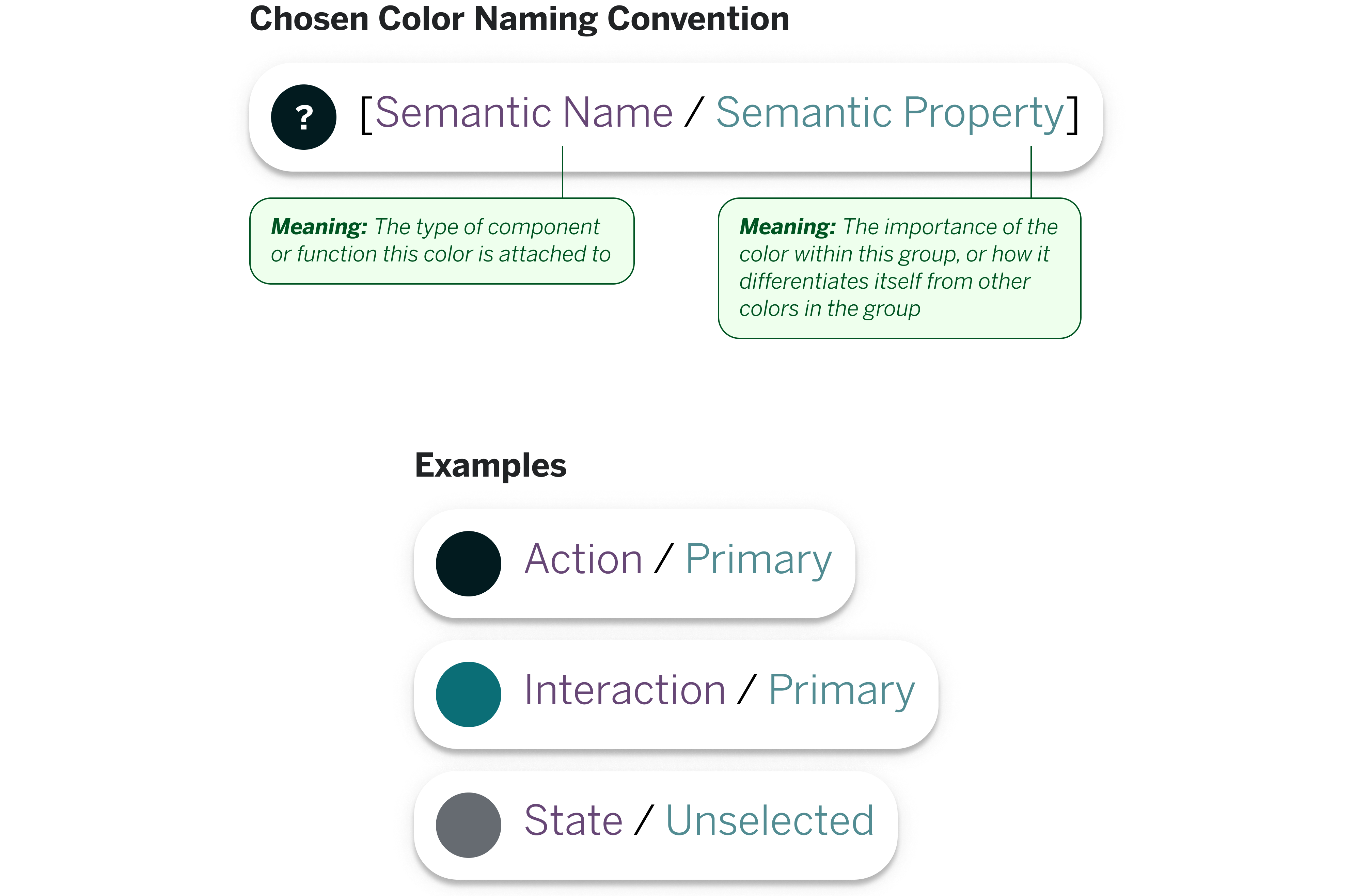
Because I wanted to denote why we'd choose different colors for the same type of component on the same web page, I reintroduced Primary and Secondary. To maintain a naming structure that calls out color function, I decided to go with [Semantic Name / Semantic Property]. Instead of making "Primary" or "Secondary" into whole color categories, I repurposed them into Semantic Properties of a color. This is because these two are abstract concepts and it's easier to attach to a concrete name, and not have it stand on its own without context.
Auditing Components
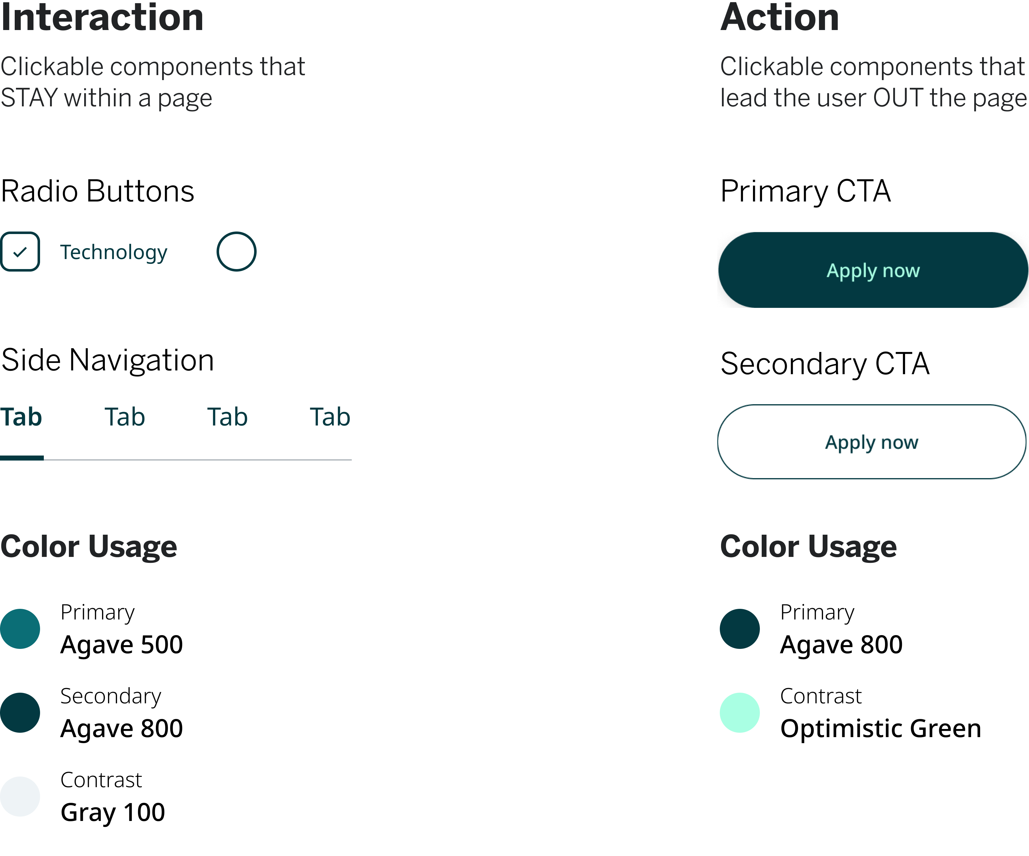
After analyzing existing components, I found it helpful to separate buttons and links into "interaction" and "action"
I found a distinct color pattern in buttons and links that lead OUT of a webpage and buttons and links that STAY in a webpage. After seeing this pattern repeated in multiple components, I presented these examples to the Robert Half design team and explained to them the pattern I found. I associated clicks that stay within a page "interaction", and clicks that lead out of a page "action". This solved the problem of some broad categories that have unclear names like "Primary" and "Secondary"
Colors In Use
Putting to my discoveries to use, I found examples where color changes could be applied to components
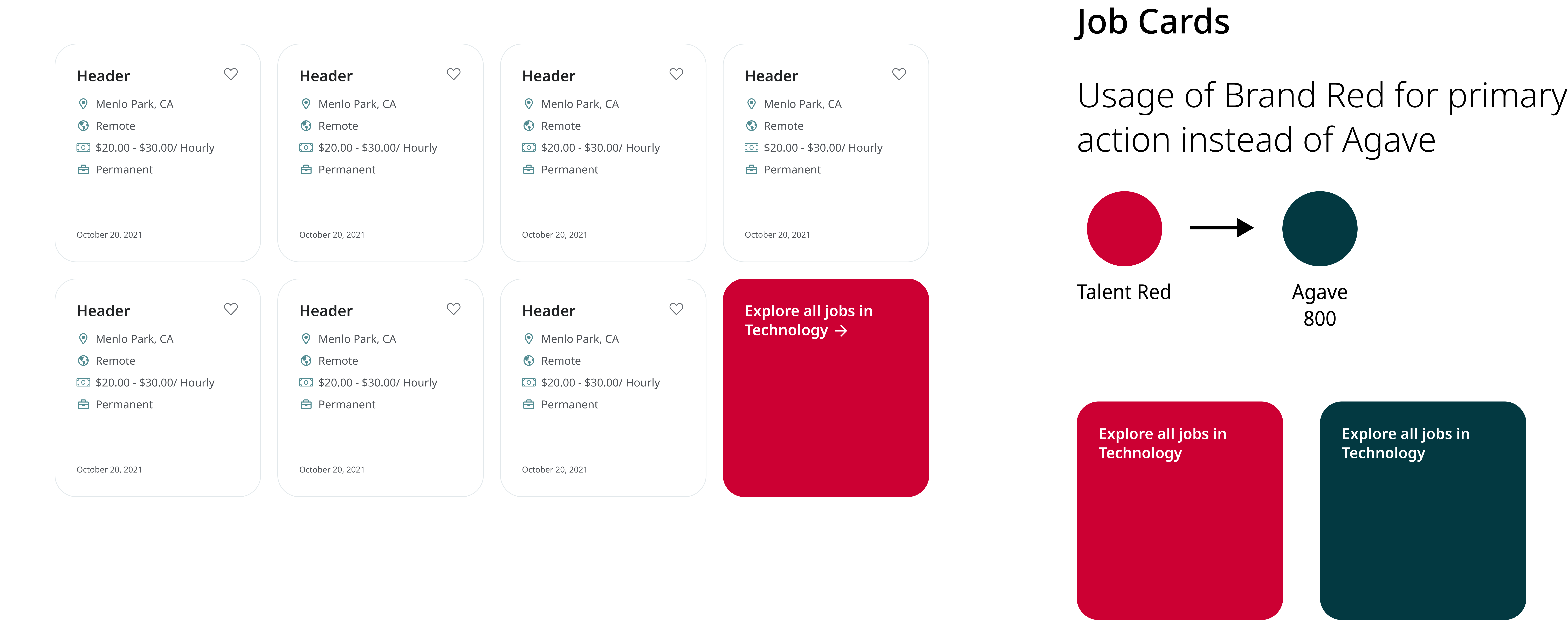
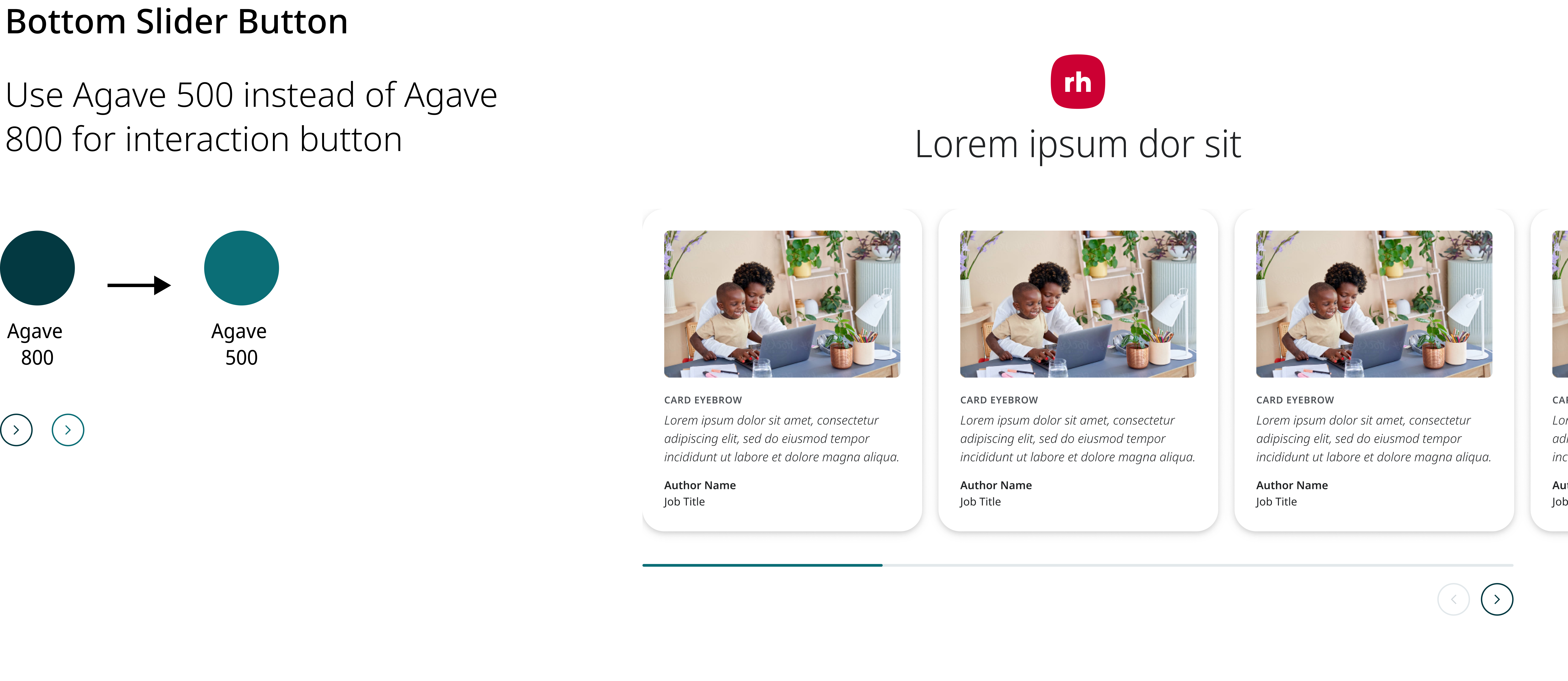
The team called components that didn't follow the correct color convention "snowflakes", and I took the time to call out where the snowflakes were in the design component library. I went beyond my initial ask to highlight the component and detail where exactly the color should be changed.
Final Deliverable
I presented this slide deck that explained to design leadership why I chose my double-tiered naming convention
I presented to a Robert Half Senior UX Architect and Senior UX Designer, explaining why I chose to create two new color sections called Interaction and Action. I also explained how calling out colors by [Semantic Name / Semantic Property] incorporated their feedback while giving a viewer a sense of color function. I also showed them how these color changes can fix confusion on their existing components and what it looks like in Zeplin. I showed this screen grab from Zeplin in my presentation to leadership.
Reflection
Being a versatile designer means using your brain along with technical skills
This internship project was unique because it didn't include problem solving through the use of Figma or visual design. It's different to work directly with stakeholders in a design operations sense, because instead of directly designing the product, we were creating the rules to help members from cross-functional teams design better. This was a niche experience that can't be taught in school, and I learned a lot about design systems and organization.
Lesson Learned
Next time, I'd love the chance to conduct more structured user testing
While my work with stakeholders and fellow designers was more in a feedback capacity, next time I'd love to conduct group user testing where they change colors on actual components to see how easy it is to interpret the colors. As I am interested with design systems work in the future, I'm really satisfied with what I got to do with this project and I'd like to try new things like more structure testing in the future.
Back to Top