Context
Our team is a world leader in quantum computing and resources
They have over 20 cloud-connected systems worldwide, including their iconic System One. Their flagship product, Qiskit Runtime, is their online quantum computing service and programming model for running quantum algorithms. Other than Qiskit Runtime, there are countless resources and way to learn about and experiment with IBM Quantum.

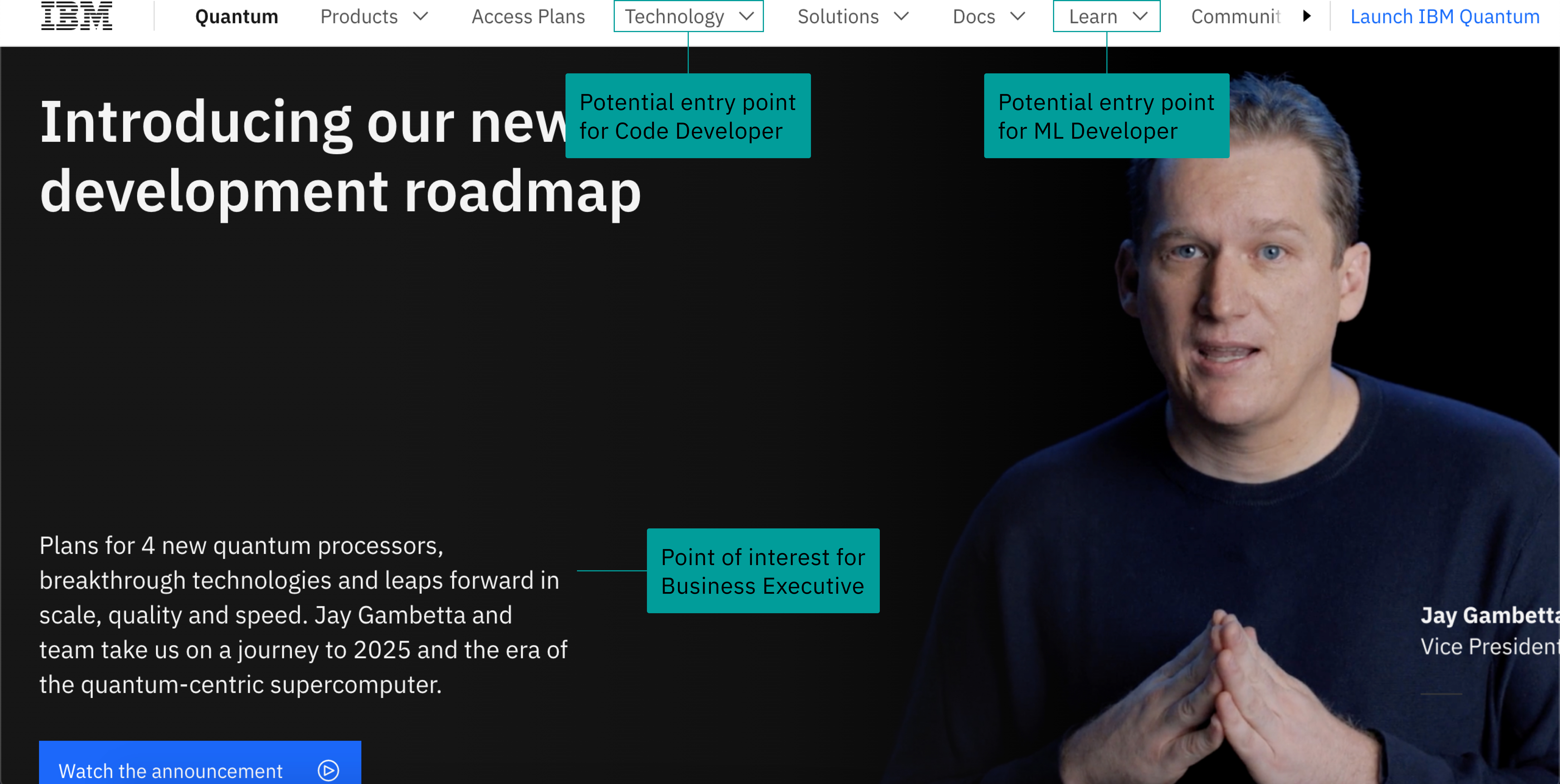
Some screen grabs of popular IBM resources that users all over the world interact with, such as Qiskit Runtime, IBM Quantum's main marketing page, Qiskit.org, and Medium blogs
Prompt
Build a dashboard tracking usage data for IBM Quantum's resources, and how well they perform
Problem: No such resource existed for our internal team to track and gain insight from IBM Quantum's offerings and services
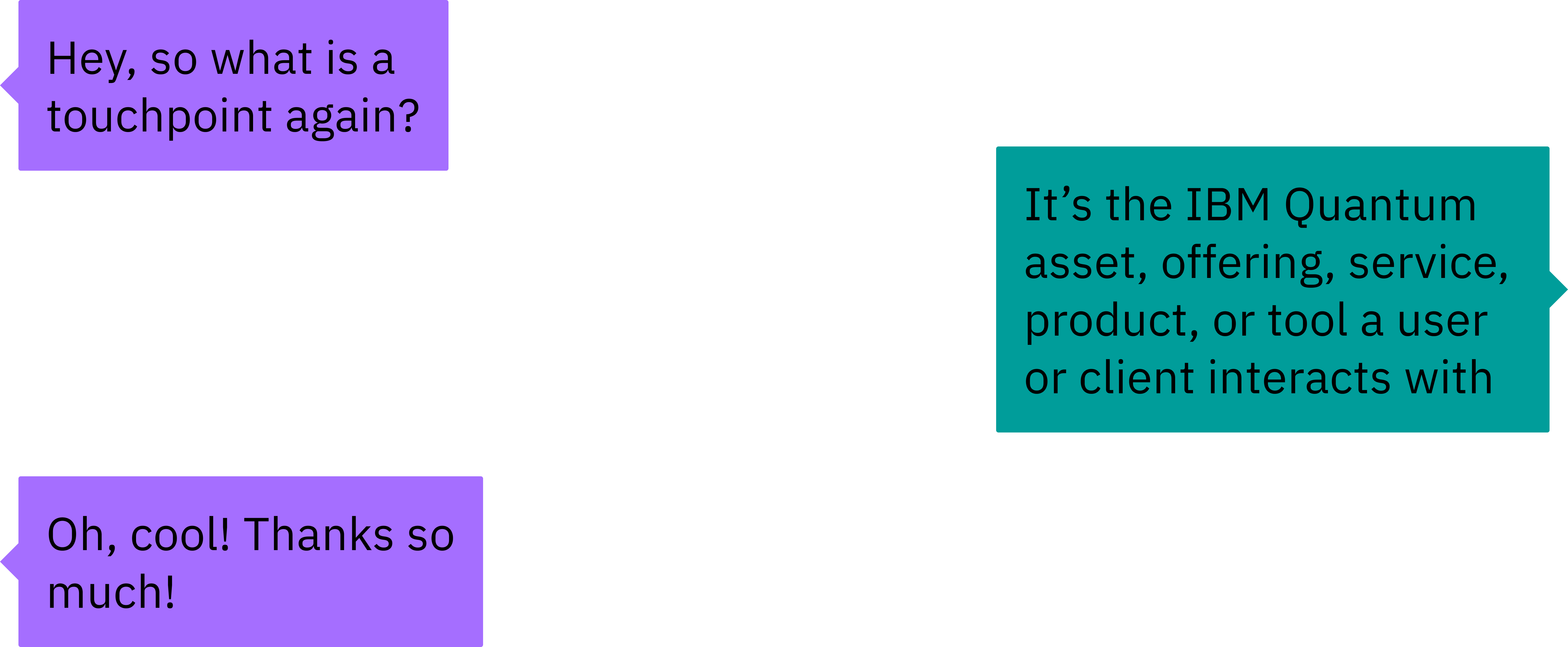
From this point on, our team referred to the online resources as "touchpoints". Our managers further defined touchpoints as any IBM Quantum website, offering, service, or product.
Prompt
Organize data by different personas who interact with IBM Quantum
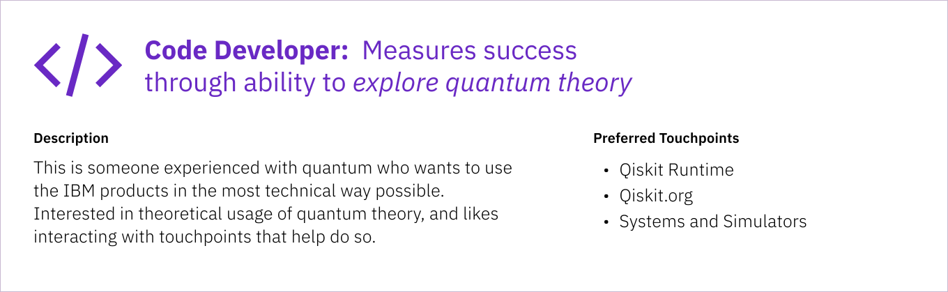
The Design Research team had previously identified three personas who most commonly interact with our touchpoints: the Code Developer, the ML Developer, and the Business Executive. Our project needed to analyze data and success of the touchpoint in relation to these personas. Personas also have identified "actions" which are descriptions of the ways they interact with IBM Quantum.
For the scope of this project, our team focused on touchpoints and data relating to the Code Developer, building the framework to scale up for the other personas later.
User Interviews
We interviewed cross-team stakeholders to gain insight on how they prefer to analyze data.
We conducted 5 interviews with a Product Manager, Data Scientist, Marketing Lead, Design Researcher, and Content Writer. They all consistently need to share out data from essential IBM Quantum touchpoints. So many touchpoints are tracked, which means that data isn't interpreted by just one team. As a result, we needed to understand different definitions of what success looks like for our stakeholder's prioritized touchpoints. It's important to know that our personas and our stakeholders are not the same people.
Persona: User or client who interacts with IBM offerings, services, products, or tools
Stakeholder: Intended user of our internal dashboard we were building
Key Insight
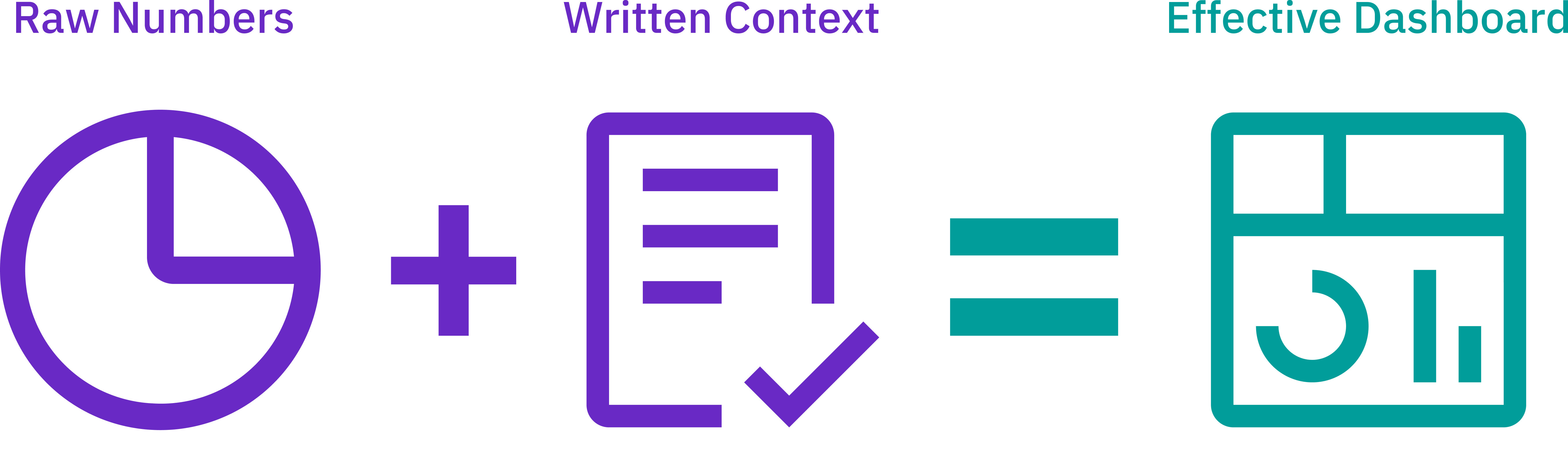
Data is given without context and needs definition points
Pain Point: All stakeholders mentioned at least one data point that they regularly analyze which was confusing to them. They have the problem of presenting data during share-outs without knowing their meaning
Opportunity: Provide context behind which research studies different data sets come from, and from what source or platform
Key Insight
Touchpoint data is often gathered from multiple sources
Pain Point: The need to go to different platforms to get data on the same touchpoint is cumbersome and time-consuming
Opportunity: Centralize information all the way from a high level to minute details, with the ability to zoom into all levels of touchpoint data.

Stakeholders were pulling data from sources such as: Amplitude, Google Analytics, Sprinklr, Metabase, and Airtable
Key Insight
Different personas interact with the same touchpoints but in different ways
Pain Point: 3 out of 5 of our interviewees interact with touchpoints that serve different personas, but raw data doesn't provide that context.
Opportunity: Create a dashboard that understands nuance in how different personas interact with different touchpoints
Early Explorations
Early mockups were from one scenario, and we presented two different options to our managers
Use Case: A dashboard user wants to understand the breakdown of touchpoint health across important Code Developer touchpoints, quickly view its metrics, and share out insights
Option 1: The user navigates from a high level overview into viewing persona actions, filtering through different touch points and metrics
Option 2: The user navigates from a high level overview to viewing touchpoints associated with the persona, zooms into a touchpoint and views its metrics
We chose Option 2 because it related to our stakeholders more and the way think terms of the touchpoints they work with.
High Fidelity
Iterations focused on inputting and categorizing info that mattered to our stakeholders
Note: Due to the dashboard's eventual implementation in Amplitude, we also made design pivots to more closely reflect Amplitude functionality
We previously did a card sorting activity with our stakeholders that revealed their top 3 prioritized touchpoints and metrics. Bringing up the fidelity meant that we needed to include those in the prototype, while organizing it in a way that didn't overload the user.
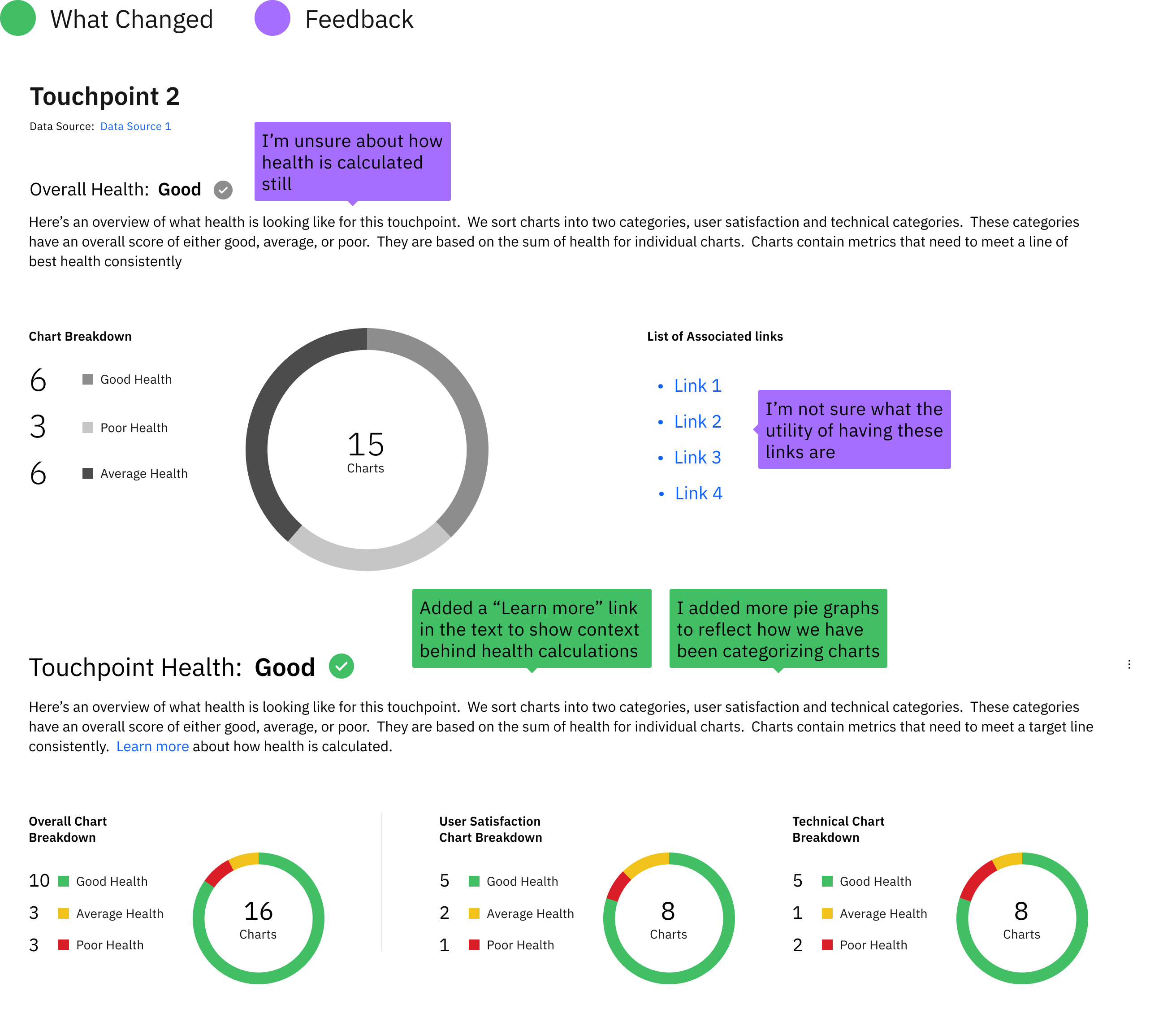
Touchpoint Health Display (Before and After)
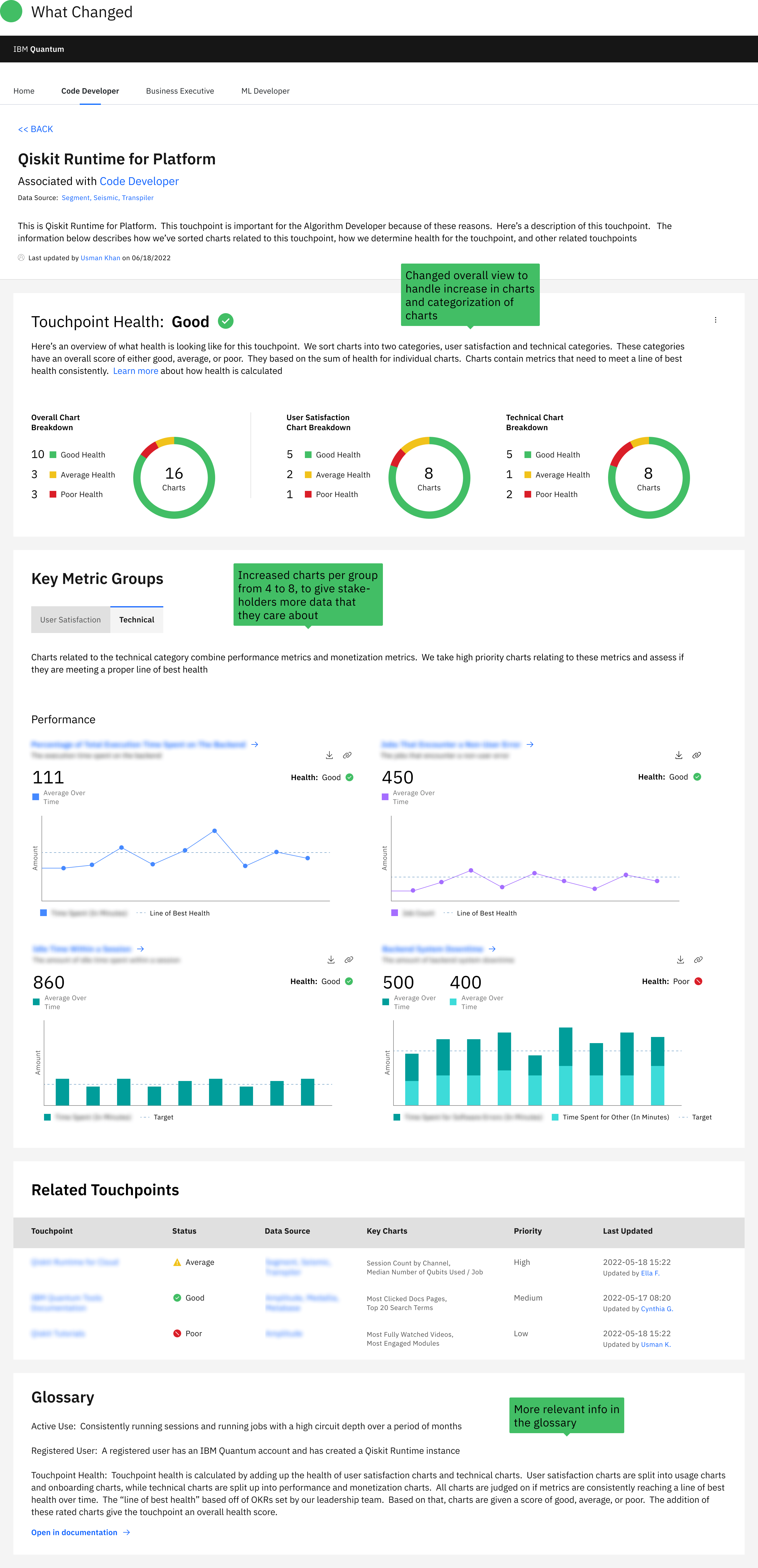
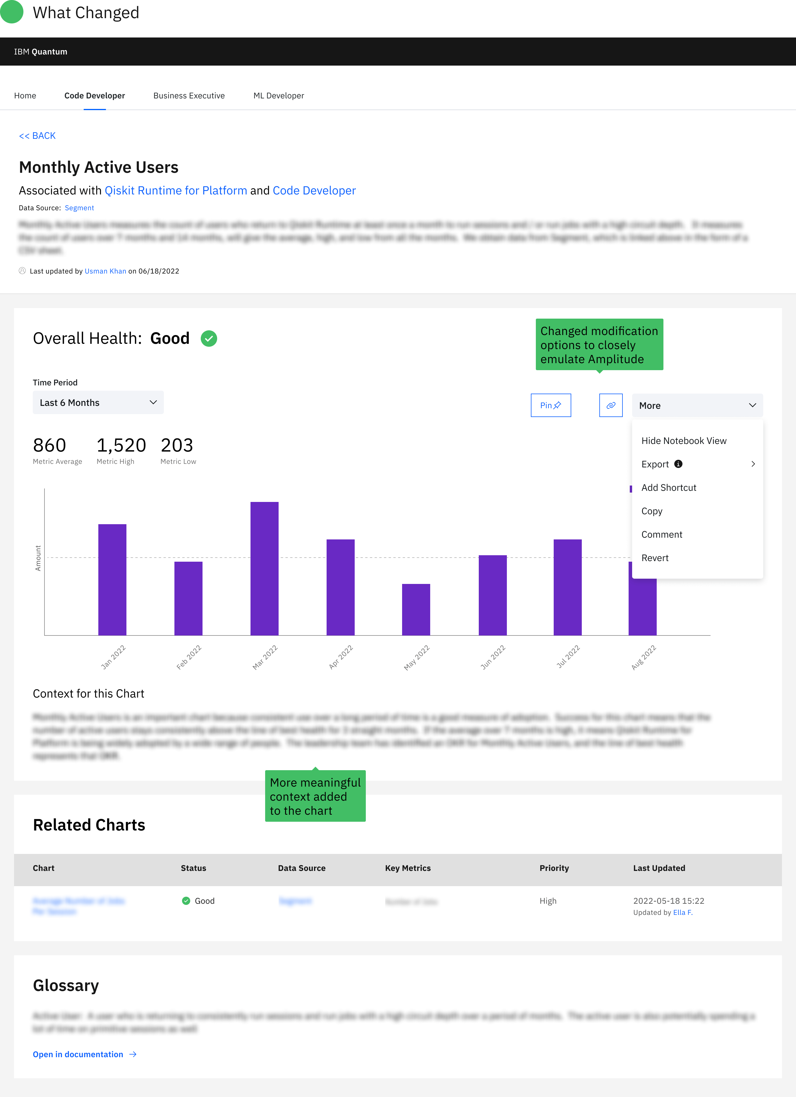
Individual Touchpoint Page
Usability Testing
Testing with stakeholders revealed confusion with context, data health, and chart categories
We went back to our stakeholders and conducted 5 interviews, over 45 minutes, and we guided them through tasks to complete in the dashboard. It gave us action items to polish our final prototype.
Key Insight
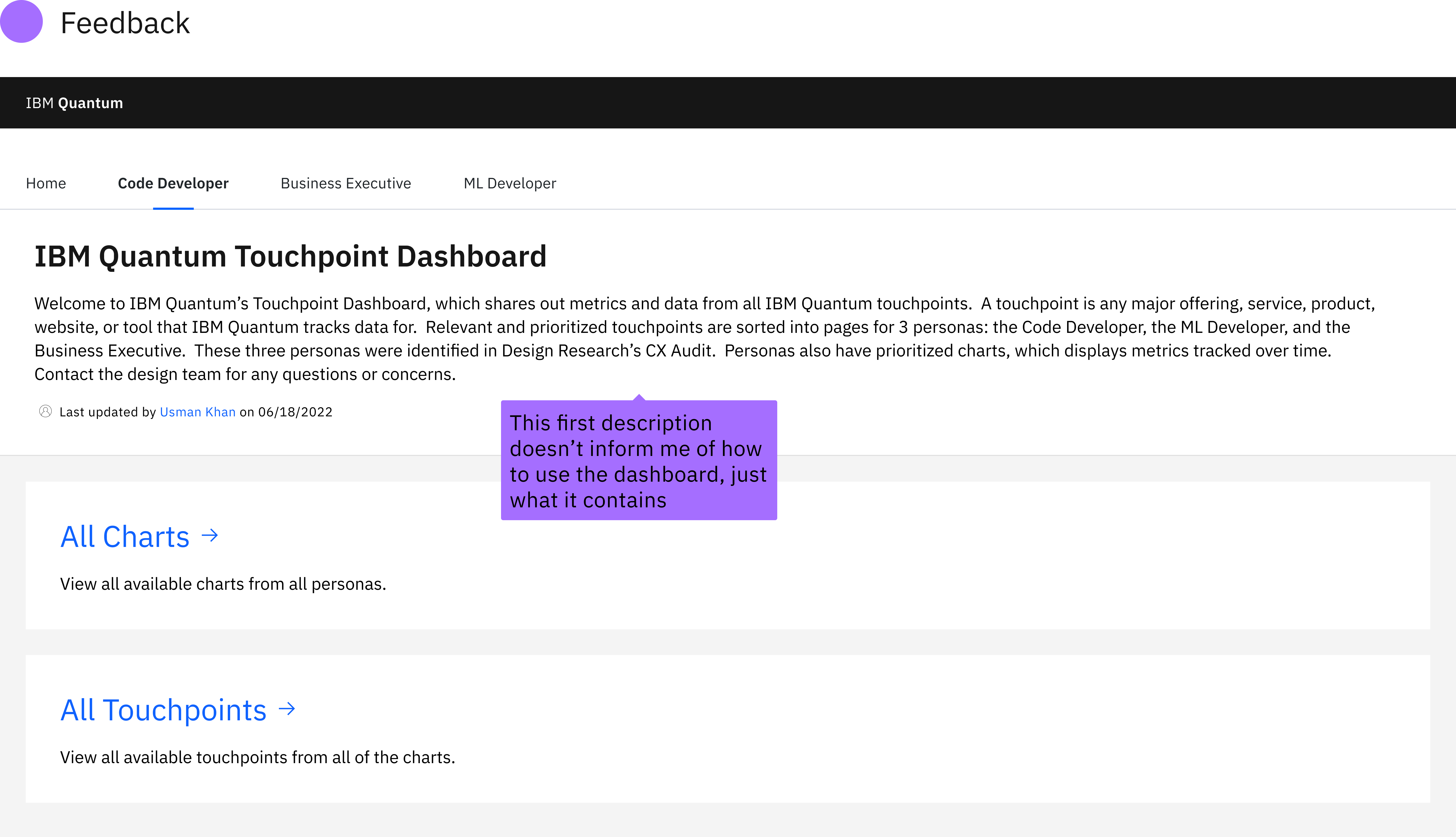
More context is needed on how to use the dashboard, not just with data
"It would be helpful to have an explanation of what the dashboard is and how someone should use it."
-Stakeholder, about the overall dashboard
Action Items:
- Incorporate more core definitions into glossary or in copy itself, around terms like touchpoints or about touchpoint health
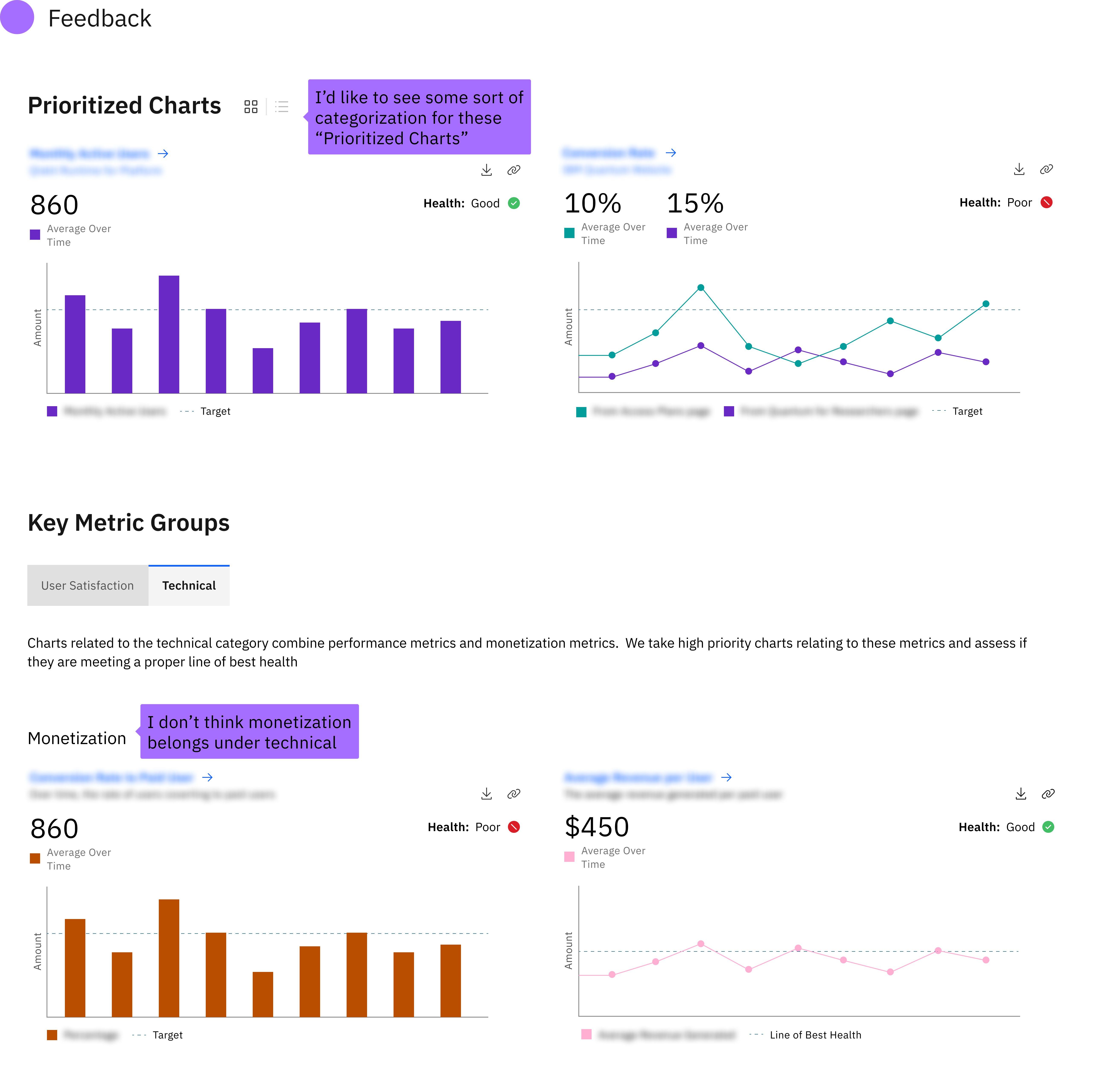
- Explain why charts are prioritized and consider renaming "Prioritized Charts" section
- Implement hover capabilities which trigger tooltips with more context and definitions for copy around the dashboard
Key Insight
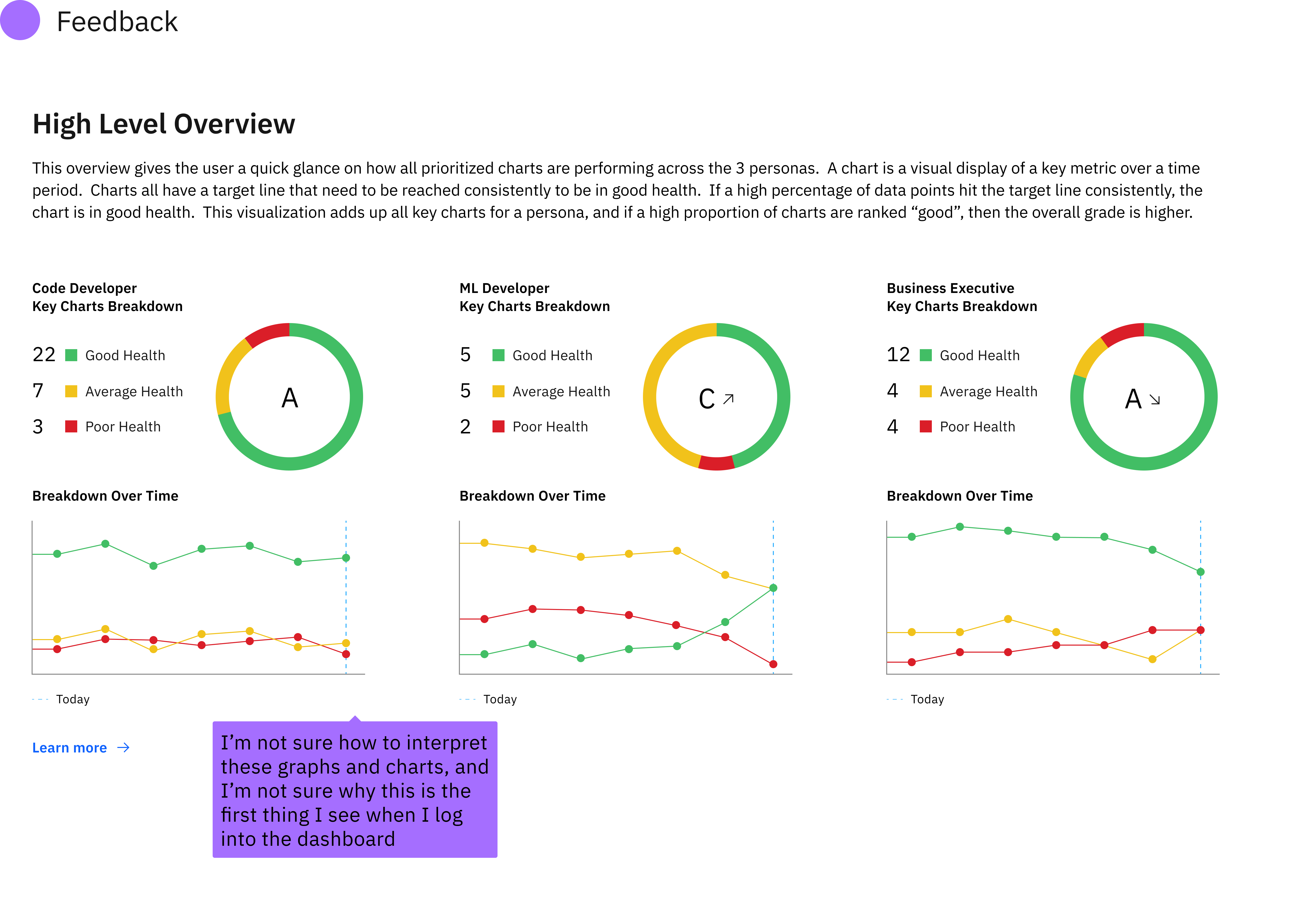
Touchpoint health was misunderstood, particularly on the high level overview
"This high level overview...I don't understand what the utility of this might be."
-Stakeholder, about interpreting data health
Action Items:
- Remove the high level section of overall health from the homepage
- Clearly define good, average, and poor health, along with the "line of best health", and make these explanations accessible
- Display how health is trending over time, not just a snapshot in time
Key Insight
Users liked having categories of charts, but found our categories confusing
"I wouldn't put monetization under technical."
-Stakeholder, about metric categories
Action Items:
- Rethink existing categories and consider adding new categories for prioritized to better represent the Code Developer journey through IBM Quantum touchpoints
Final Deliverable
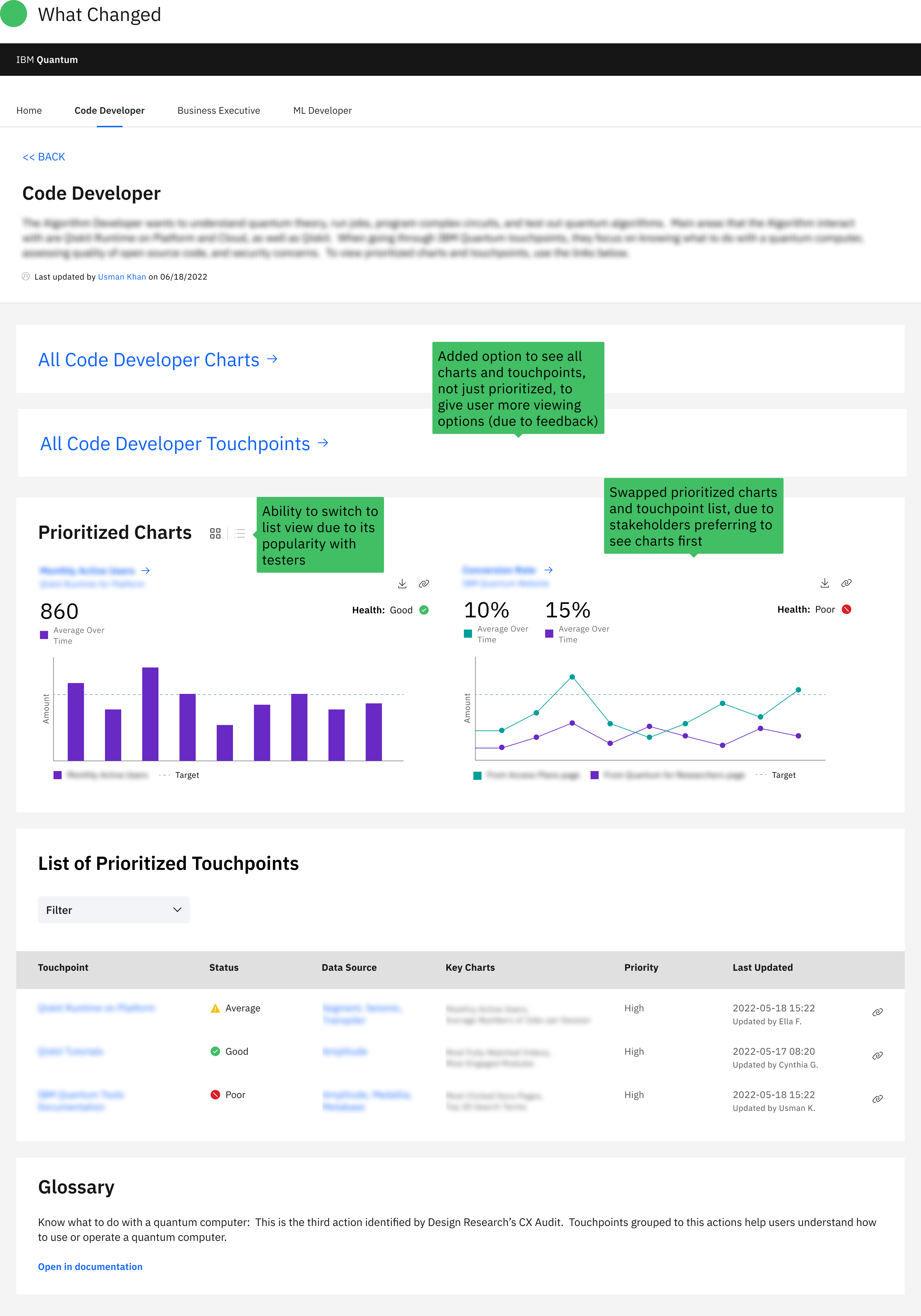
We rethought how to organize data displays based on the Code Developer's journey, and added key hover features
We used more accordion to add sub-categories to our existing groups, and to hide info from the user to not overload them. Also, a key addition to our prototype was hover capabilities, to give more context to unknown terms as well as defining touchpoint health,
Reorganization of data displays
Problem: Charts on the Code Developer page needed to be recategorized to better reflect the persona journey through IBM Quantum touchpoints, so that stakeholders can derive insights from data in a way that makes sense.
Solution: Sort prioritized charts using IBM's Universal Experiences, which is a framework for understanding client relationships with IBM products
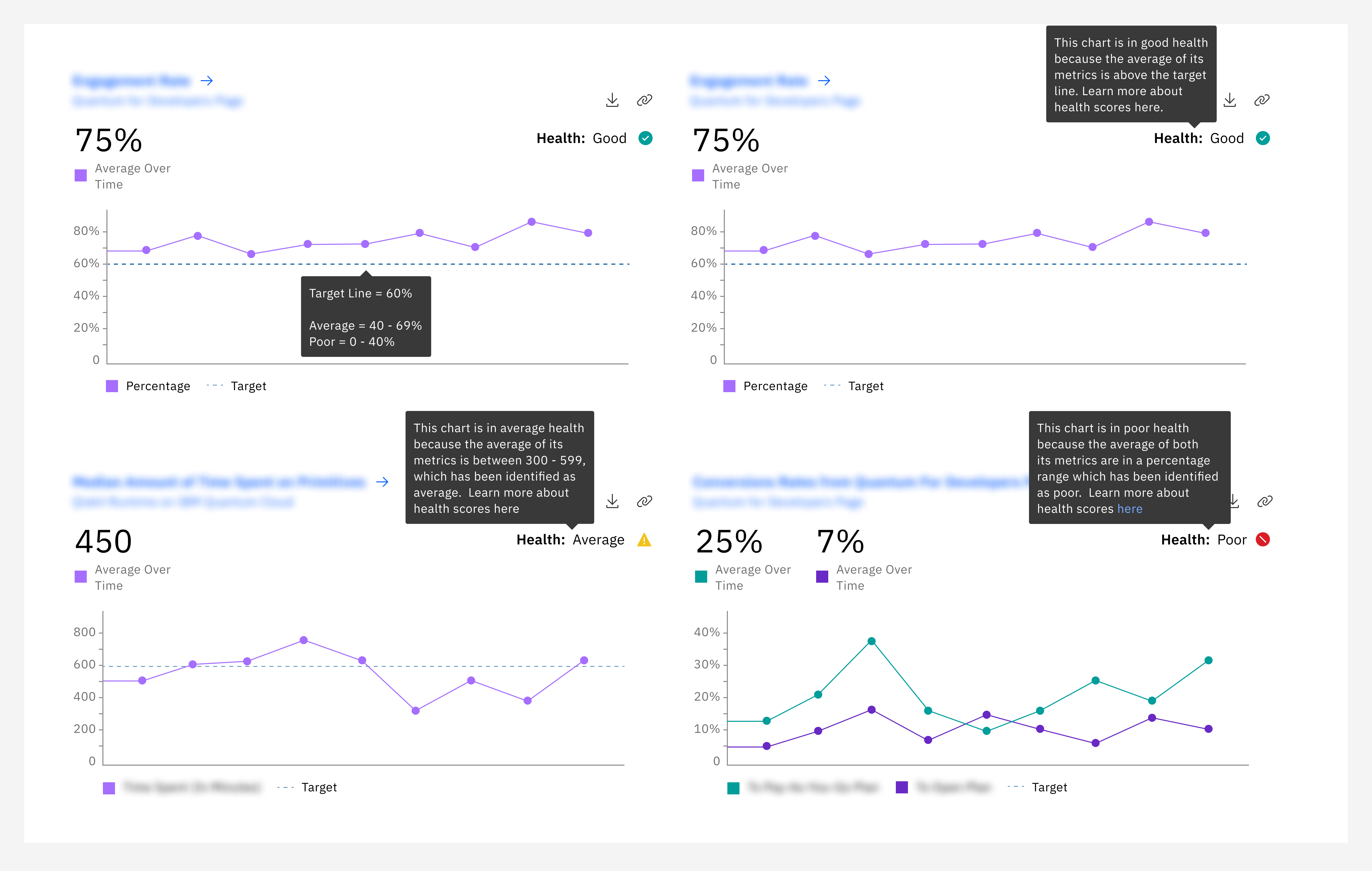
Added context for health and terminology through hovering
Problem: More context was needed to explain what we meant by "health" and also unfamiliar terms, such as good, average, and line of best health. More context was also needed on how to use the dashboard
Solution: Add hover interactions directly over icons or words that were confusing our stakeholders so that they gain a deeper understanding of what we are trying to say
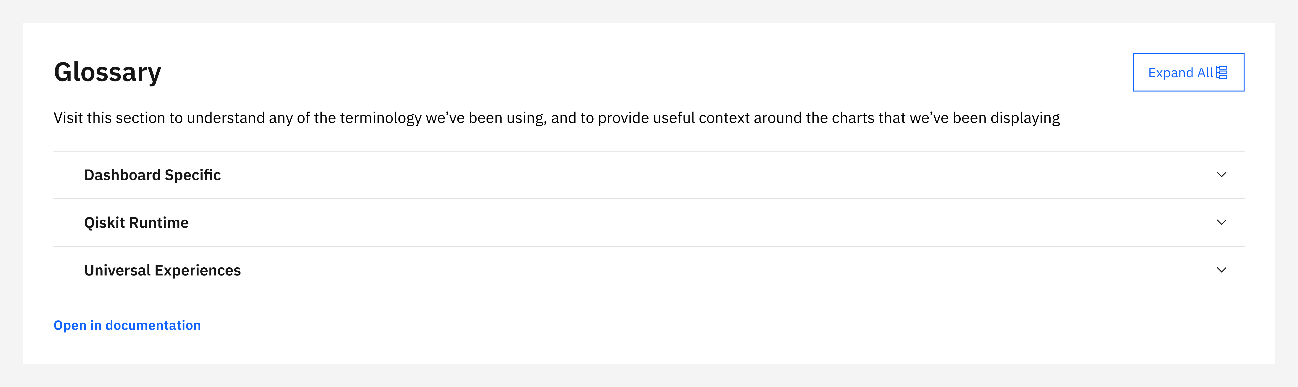
Multi-tiered glossary
Problem: Our current glossary wasn't robust enough to help ease our current stakeholder's issues of understanding context within the dashboard
Solution: Add accordion dropdown that mirrored the categorization of the charts, so that we could reveal more without taking up so much space
Impact
Initial implementation was cut down from a months-long process to only 20 minutes
The creation of this dashboard was a core need across the vast Quantum organization, but because of how spread thin the Quantum designers were, no one had the time to dive deep into implementation. That’s where the intern team came in, and our months of research, discovery, ideation, and creation made the implementation process in Amplitude much quicker

Our design research manager shared with us the homepage of our dashboard that only took 20 minutes to complete. I blocked out sections for privacy
Reflections
Be patient, gather information, and design with sure footing
My design nature involves diving deep and getting granular into details. With IBM, I felt that I was a really good fit for the internship program because of how process-oriented it was, but I also learned about being patient within that process. Working within a team shifted my perspective as well, because I didn’t want to trip anyone up by introducing new information that could give my teammates more content to worry about.
Lessons Learned
Being a team player is as important to me as individual design contributions
My internship experiences have involved a lot of solo projects supported by senior designers, and this was my first time working in a consistent team with fellow interns for a long time. I wanted to make a mindful effort to allow all voices in the room to drive conversation forward.

This is the team giving our final presentation! I blurred out faces for privacy


.png)
.png)